Recording a Screencast In Ubuntu Tutorial
Want to record a screencast in Ubuntu? Charles Profitt in a smack of irony that even the most ironic of hipsters would admire, has recorded a *screencast*…about how to make a screencast in Ubuntu. Great work, Charles!
See the video [right here](https://www.youtube.com/watch?v=A0Tn3Z8OklQ)!
Be sure to post links to your screencasts in the comments!

Menu Discoverability In Ubuntu 11.10
Before I get started I want to provide a cast-iron caveat here: *I am not a professional interface designer*. While I have an interest in interaction design and usability, it is not my profession and most of my experience is from working on spare-time projects and developing interfaces for those projects. In other words…the views expressed here are not born from formal training.
OK, with that out of the way I just wanted to talk about menus a little. Recently we released [Ubuntu 11.10 Beta 1](https://cdimage.ubuntu.com/releases/oneiric/beta-1/) and there was the [requisite review on OMG! Ubuntu!](https://www.omgubuntu.co.uk/2011/09/ubuntu-11-10-beta-released-reviewed/) and the conversation in the reader comments rather unsurprisingly descended into a debate about the menus and window controls in Ubuntu 11.10.
Let me explain the source of the debate. Here is a screenshot of Firefox in Ubuntu 11.10:
As you can see there are no windows buttons up there in the top-left corner of the screen and the menus are not visible either. All you can see is the application title. If you hover over the application title the windows buttons and menus appear so you can use them.
Now, I can understand how this has caused some controversy; the screams of armchair usability pundits rattling off concerns of “*this is a regression in discoverability of the menu and windows buttons*” can be heard in the galleys of that OMG! Ubuntu article. Conceptually I see their point; if the menu is not visible, and it is not in the application window, how do people find it?
This is a misnomer though. Usability and interaction design is all about balancing the effectiveness and discoverability of an interface with the aesthetics of a beautiful, desirable product that we *want* to use. We don’t just want to build functional technology; we want to build desirable, pleasurable technology that fits into our lives.
If the argument is that we need to expose functionality for it to become discoverable we can do this but such exposed functionality is often not beautiful and desirable. As an example, this is *Microsoft Word* with all the toolbars switched on
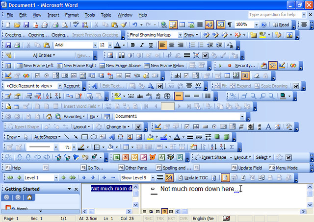
Clearly having everything switched on does not create a beautiful and desirable interface, and I can understand the retort to this would be “*sure, Jono, but menus and window controls are a basic and common function in an interface, so we should prioritize their discoverability and visibility*”. I am not sure I would agree with this. While they are an important and useful function in Unity, the point I take issue with is that they *need to be visible all the time* for people to understand where they are and how they function.
My thesis as to why is pretty simple: *people learn by exploration*. Let’s do a quick exercise. Write down on a piece of paper the last three devices that you purchased. They might televisions, cell phones, kitchen appliances, games consoles, or whatever else. Every one of these devices comes with it’s own interface to operate it. Now, how many of those devices did you sit down and read the instructions for? I am willing to bet it was close to *none*.
You learned those devices by poking around, trying things out, clicking, pressing, pushing, and otherwise playing with and exploring it. Many of these devices will have had entirely new interfaces to you which you had not used before, yet you figured them out. Some elements of the interfaces will have been obvious (e.g. buttons protruded to indicate that they can be pressed) and some elements less-so.
This is why I think the menu and window controls decision makes sense. People like to explore, and it will take next to no time for Ubuntu users to discover that hovering over the text in the panel will display the menu and the window controls. The same can be said for discovering that if you hit the left side of the screen the Launcher appears. The point here is that when you have discovered that the menu is there, you *don’t need it to be visible all the time*.
Instead you can hide it and present a far less cluttered interface. Put it this way, let’s look at the two options:
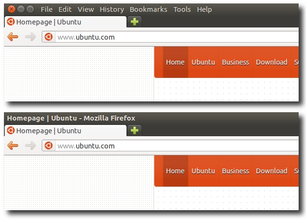
Personally I think the latter looks far sleeker, less cluttered and pleasant to use. Having used Ubuntu 11.10 for a month or so, this small change has really been a nice touch and I am pleased that these small touches continue to refine the Ubuntu experience into a truly desirable and powerful product that is simple and effective for everyone.
Ubuntu Membership Process Survey Report and Next Steps
The Ubuntu community, like many communities has different methods in which we identify and elevate the privileges of those who actively participate and contribute good work. As an example, if you do great packaging and development work, you can get upload access to the archive with MOTU or Core-Dev.
A core means of identifying such contributions is the [Ubuntu Membership](https://wiki.ubuntu.com/Membership) process. Ubuntu Members are those contributors who have made a *significant and sustained* contribution to the project across one or more of the many different ways you can participate (e.g. LoCo Teams, Documentation, Translations, Packaging, Testing etc).
Recently there was a little debate about some aspects of the process and how well it is functioning, and it struck me that we don’t have enough data to help get a good idea of the feedback and opinion of those folks who have been through the Ubuntu Membership process. As such, I put together a survey that went out to everyone who has applied to be an Ubuntu Member in the last few years to get their feedback. I am presenting the results of this survey today.
Generally the feedback is very positive, but there are definitely some areas where we can explore how to refine and improve the current process.
**[Download The Report](https://ubuntuone.com/7JTEZG0YScFj9mliRJPcCI)**
Tomorrow, *Tues 6th Sep 2011*, we have a meeting scheduled with the Community Council at *9pm UTC / 2pm Pacific / 5pm Eastern / 10pm UK / 11pm Europe* in `#ubuntu-meeting` on freenode and we will discuss this topic there. I recommend everyone who wants to participate at the meeting downloads the report and familiarizes themselves with the findings.

Five Years At Canonical
Yesterday was my five year anniversary at [Canonical](https://www.canonical.com). I know people tend to get pretty gushy on anniversaries, so I am going to keep this as short as possible.
When I joined Canonical life was quite different to how it is now. I was living in the UK, had more hair, Canonical was a small company with an office the size of my current living room, it had the fairly singular focus at the time of shipping an integrated Free Software desktop, and the community team comprised of just myself. Today I am now married and living in the USA, have less hair, have a team of four (soon to become five), and Canonical has grown extensively, diversified, and expanded it’s operations.
Over the last five years there has been tremendous change and opportunity in both Canonical and Ubuntu. From a company perspective, this growth has brought challenges surrounding how we scale our operations up while still maintaining our core values, and bringing a phenomenal range of talent to the company. In particular I have been delighted to see the contributions of the *Design Team* and the *Desktop Engineering* team who have entered a tight-knit engineering culture and helped us to think differently and innovate across our products and how we represent ourselves in professional and consumer environments.
From an Ubuntu perspective, we have been doing what I always dreamed of when I first got involved in Open Source – *breaking down the barriers to bringing Free Software to everyone*. Back when I joined Canonical, the game was more straight-forward; keep on integrating great upstream software into an Operating System that primarily meets the needs of Linux enthusiasts. Our vision has now expanded; while we certainly want to encompass the needs of Linux enthusiasts, we want the Ubuntu Desktop to also appeal to a wider consumer demographic and Ubuntu Server to appeal to a wider DevOps and cloud demographic too, and this has involved breaking down more and more complex barriers. Achieving this is not just a software engineering challenge, but a design, services, business, community, and product journey challenge.
There have been some tough times over the last few years in breaking down these barriers, and some folks have been critical of our decision-making, but I strongly believe the decisions we have made have been sound in charting a course for success and the intentions of my colleagues and myself continue to be sincere. While our strategy has adjusted, molded and reacted to change, our intentions of bringing freedom and opportunity to technology have been consistent and unwavering. Freedom of code and collaboration continues to be at the heart of what we do in Ubuntu, but I also believe the truest freedom we can bring is in making technology and the opportunities that technology presents available to *all*, not just to those who understand the devil in the detail.
While Canonical has grown and diversified, I am pleased to see the spirit, enthusiasm and values of Canonical have remained. The reason why I joined Canonical was because I felt it understood community and could provide an environment to enthuse and support community growth and also deliver success in bringing freedom in technology to everyone via Ubuntu. I still believe those values are strongly ingrained in the DNA of Canonical.
Over the years I have been excited about various decisions and features we have brought to fruition in Ubuntu, but in the history of my involvement in Ubuntu *I have never been so excited about the opportunity that Ubuntu brings on the Client, Server and the Cloud*. I believe we better understand the opportunity and the challenges that face us and we as a community have the capabilities to achieve great things and the confidence make complex and at times difficult decisions in the wider pursuit of bringing Ubuntu and software freedom and opportunities to everyone.
These are hugely exciting times, and I want to thank everyone in our community, my wonderful team, and my colleagues at Canonical for continuing to make the journey so worthwhile.

Better Community With Better Technology (In Practice)
Back in June I wrote a blog entry called [Better Community With Better Technology](https://archivedblog.jonobacon.com/2011/06/06/better-community-with-better-technology/) which discussed some ideas about how we can better integrate our Ubuntu community work into the desktop. Today much of the interaction we have with the Ubuntu community is through a web browser and I feel like we have some wonderful desktop technologies that could improve how we conduct this work.
My major reason for blogging it was to share the idea — I knew I didn’t have the time to implement it myself, but I figured someone may be motivated by the notion and want to create a project that implements the idea.
Well, total-legend, *Oier Mees* did, and I wanted to share Oier’s work here.
Oier was specifically interested in the bugs idea highlighted in the post that looked like this:
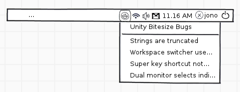
THe post outlined the goal of this feature:
> You are a new developer and you are interested in contributing to a given project (e.g. Unity). You always want to know which bitesize bugs are going to be great places to start. You install indicator-bitesize and you can set which projects you are interested in and it will show the highest priority bitesize bugs for that project. Clicking on each item takes you to the Launchpad bug report with the details.
> This indicator would regularly poll Launchpad to update the list when items are tended to and new items appear. The indicator would change color to indicate that there is new content.
Well, Oier got to work and created such an indicator:

The indicator looks like the one above when there are no bugs. Next you can configure the indicator for different projects:
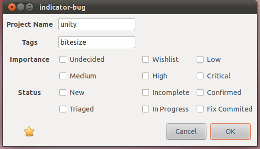
When you have added the projects you are interested in, the indicator will light up to indicate that there are bugs available:

Clicking on the indicator now shows the available bugs to review:
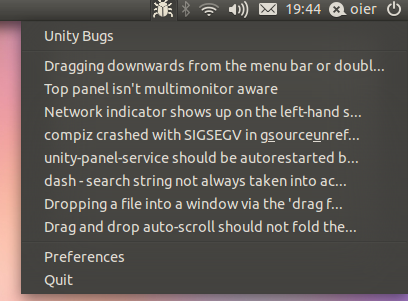
The indicator will then poll regularly and update when there are new bugs available. You are only then a click away from getting to the bug, triaging, leaving comments, or fixing it.
What is awesome is that Oier has written some code, added it to Launchpad, created a PPA and even had the indicator **translated into 11 languages**! Oier is looking for volunteers to help contribute to the indicator, so be sure to click the following links and get involved:
* **Project Page** – [https://launchpad.net/indicator-bug](https://launchpad.net/indicator-bug)
* **PPA** – `ppa:oier/indicator-bug` from [https://code.launchpad.net/indicator-bug](https://code.launchpad.net/indicator-bug)
* **Translations** – [https://translations.launchpad.net/indicator-bug](https://translations.launchpad.net/indicator-bug)
I am sure Oier will be reading the comments from this post, so feel free to ask questions there. Great work Oier!
Loco Team Portal Gets Blogging Support
[Back in May](https://archivedblog.jonobacon.com/2011/05/26/future-loco-team-portal-plans/) I blogged about some plans that we were putting together for the [LoCo Team Portal](https://loco.ubuntu.com) to make the site more dynamic and more of a hub of information and visibility on the great work going on in the LoCo community. My thesis was that community members really cherish the kudos and support of the wider community when it comes to their accomplishments; unfortunately, we didn’t really have a good place to provide a rolling list of accomplishments and work going on the LoCo community.
As such I organized a regular call with Michael Hall, Chris Johnson, Nigel Babu, Laura Czajkowski, Ronnie, daker, and Randall Ross to discuss the idea of making the LoCo Team Portal more *tabworthy*. What I mean by this is making it a site that I always want to have open in a tab because it provides a regular stream of interesting content. To do this we discuss building in blogging support into the LoCo Team Portal to provide this firehose of content.
I am delighted to see that the first iteration of this work has landed and you can [see it here](https://loco.ubuntu.com).
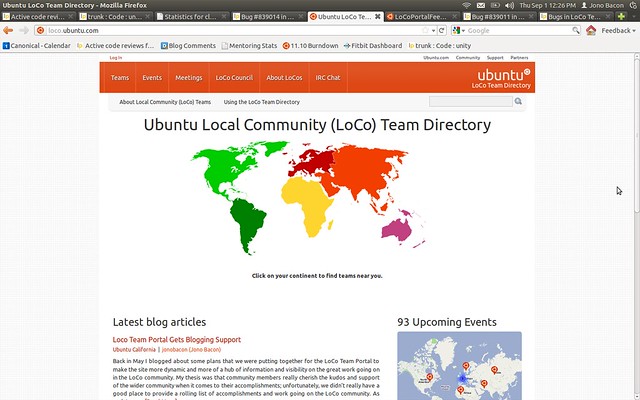
Thanks to everyone who participated in the development of this work; this was a true community project, driven, implemented and delivered by a team of web programming legends. Thanks also to Matthias from Canonical IS for deploying it ready for the Ubuntu Global Jam!
## Adding Your Feed
Adding a feed is simple. To have your feed on the site you must be *an approved team* and have a feed that *only talks about LoCo content* (a category RSS feed is good for this.
To add your feed just go to [this wiki page](https://wiki.ubuntu.com/LoCoPortalFeeds) and follow the instructions. Someone will review the feed and add it if it is felt appropriate.
Be sure to get your feed requests in!
## Future Improvements
This work has already made the LoCo Team Portal more valuable but there are a few key improvements that I think can continue to make the site more tabbable and bring more value to the LoCo Team Portal and the wider community:
* [#839014 : Blog Support – Show either the full post or more content](https://bugs.launchpad.net/loco-directory/+bug/839014)
* [#839023: Provide a method of dismissing the map](https://bugs.launchpad.net/loco-directory/+bug/839023)
* [#839003: Blog Support – Provide commenting facility inside loco.ubuntu.com ](https://bugs.launchpad.net/loco-directory/+bug/839003)
* [#839011: Blog Support – Show country flag for each blog entry summary](https://bugs.launchpad.net/loco-directory/+bug/839011)
Thanks again to the wonderful work of Michael Hall, Chris Johnson, Nigel Babu, Ronnie, and daker for making this vision happen, and I look forward to it’s continued evolution!

Ubuntu One Developer Evening In Manchester On Thursday
Everyone knows what [Ubuntu One](https://one.ubuntu.com) is, right? While you may know it as the system for syncing your files, contacts, notes, and bookmarks, and where you can buy and stream music, Ubuntu One is also a comprehensive [developer platform](https://one.ubuntu.com/developer/). With it you can utilize pretty much all of these services right from your app, and Ubuntu One brings some pretty compelling opportunities to desktop, web, and mobile apps.
Didn’t know this? Well, fasten your seatbelts.
On **Thursday 1st September** at **7pm** in **Lecture Theatre C014 at Manchester Metropolitan University** the ever-enjoyable [Stuart Langridge](https://www.kryogenix.org) will be giving a presentation about how to write applications that harness Ubuntu One. He will talk about the different APIs, how to write web, desktop and mobile apps using the technology, and the interesting ways in which Ubuntu One can empower your apps.
In addition to this there will be a chance to have a few drinks afterwards, get to know the attendees and the Manchester techn community, and have a great time.
To join, [register on eventbrite](https://www.eventbrite.com/event/1981804631) and also see the [lanyrd](https://lanyrd.com/2011/u1appdev-september/) link.

Ubuntu 11.10 (So Far) Screenshot Tour
So here we are in the thick of the Ubuntu 11.10 Oneiric Ocelot development cycle, and I am really excited about the progress that is being made. I thought it could be interesting to show off some of the work that is going on with a quick screenshot tour.
This cycle has been very much focused on integrating GNOME3 into Ubuntu and focusing on fit and finish both at a software and design level on Unity and it’s components. The goal with Ubuntu 11.10 is to build on the accomplishments in Ubuntu 11.04 and to continue refining the experience.
Before, I start, remember, there are a few caveats here:
* Ubuntu 11.10 is not finished. There are still plenty of bugs, quirks and other oddities that need fixing.
* What you see here may well change.
* I have smudged out some personal bits, but it should be pretty clear which bits are smudged out.
Oh, and click on the images below to see them full-size.
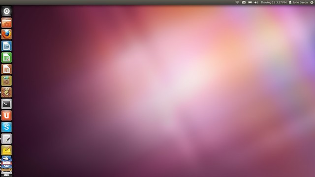
So let’s get started with what the typical desktop looks like right now in 11.10:
Here you can see a few changes:
* The Ubuntu button is now on the launcher (user testing told us most people look there to launch applications).
* There has been some small changes to the indicators in the top right part of the screen.
* Here you can see I have a number of apps open, and see the concertina effect on the Launcher.
* Note how there are no longer Apps / Files places on the Launcher.
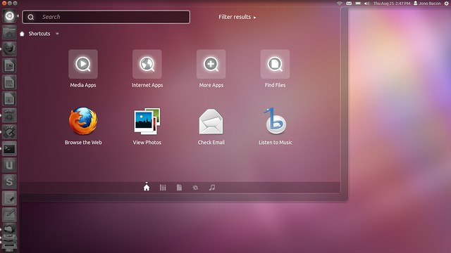
So, if you click that Ubuntu button on the Launcher you see the new Dash:
Here the dash opens up in this really nice translucent way, and the launcher and panel look nice and translucent too. The translucency is actually tweaked based upon your wallpaper, so it shades it smartly.
You can see at the bottom of the dash are a series of little icons. This is now where you find your different lenses (Apps, Files, a new Music one, Gwibber etc) and this makes it much nicer to see the different types of lens, instead of having to find them on the launcher.
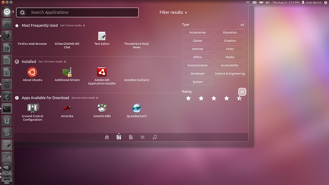
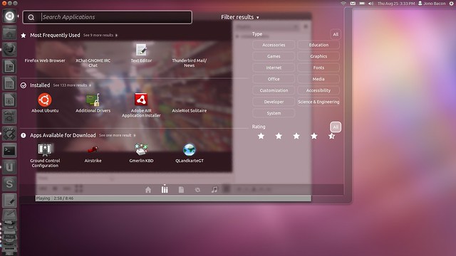
Let’s take a look at the Apps lens:
(*I know some icons are missing in this screenshot, that is a bug*)
Here you can see the lens works in a similar way as the apps lens in 11.04, but we have this new *Filter Results* feature (which is open in this screenshot). Here you can select different categories and those categories will only be shown in the icon view on the left. You can also search by rating which is useful for apps that are shown available to download.
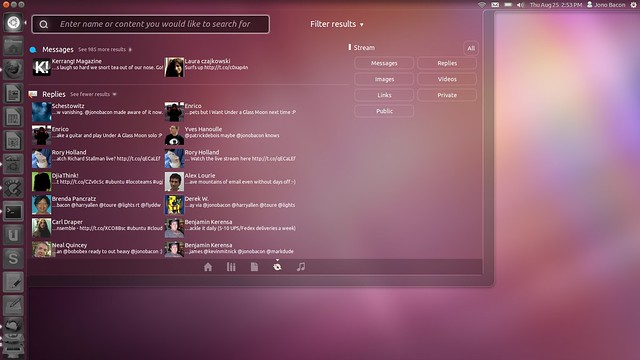
Different lenses have different types of filters. As an example, here is the Gwibber lens:
As you can see this provides different methods of displaying different types of content.
One other cool element of the dash is that it uses an active blur. This means it really blurs what is behind it, so for example, it will blur a video as it plays behind it in the movie player:
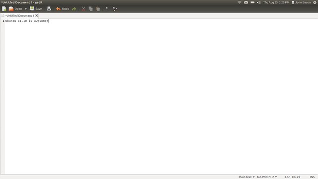
Let’s now look at loading apps. Here is GEdit in it’s maximized state:
As you can see, Unity provides a lot of workable space and the shell just wraps around the app in the most minimal way possible to give you as much space as possible for the app. You can also see that when maximized the window buttons and menus are not shown; they only appear if you hover the window title with the mouse. This actually makes the desktop feel much nicer and less cluttered.
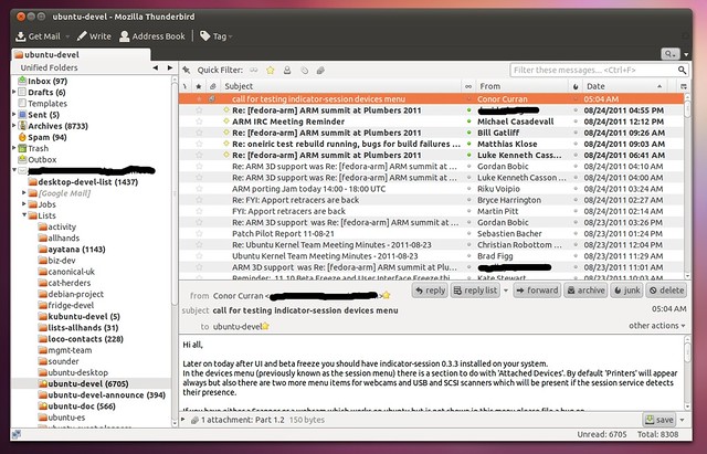
Here you can also see that the toolbar buttons have been styled with the dark theme to carry this theme throughout the desktop. This is a subtle but really nice change. As an example, here is Thunderbird with the same style applied:
In the GEdit example the icons are not monochrome but the Thunderbird ones are. We are not expecting an icon refresh in Ubuntu 11.10, but I suspect in the future we will see more icons tuned for the darker toolbars. Here is the compose window:
An app that has had quite a refresh has been Gwibber:
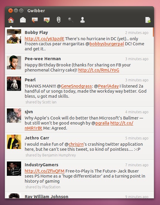
Gwibber is now much faster, much sleeker to use, and just a far more pleasant social networking experience. It also looks wonderfully consistent with the dark theme.
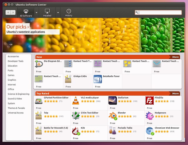
Another app that has been re-jigged is the Ubuntu Software Center:
The new Ubuntu Software Center feels faster, is more interesting to look at and explore, and feels far more integrated into the system.
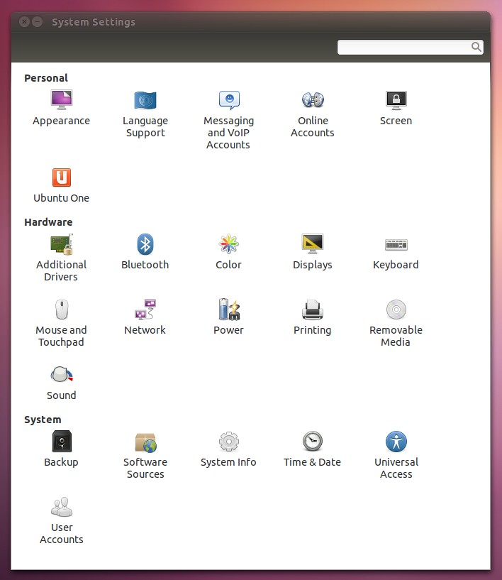
I am also delighted to see the wonderful work that has gone into the GNOME Control Center in GNOME3 also brings the same consistent look, feel, and ease of use:
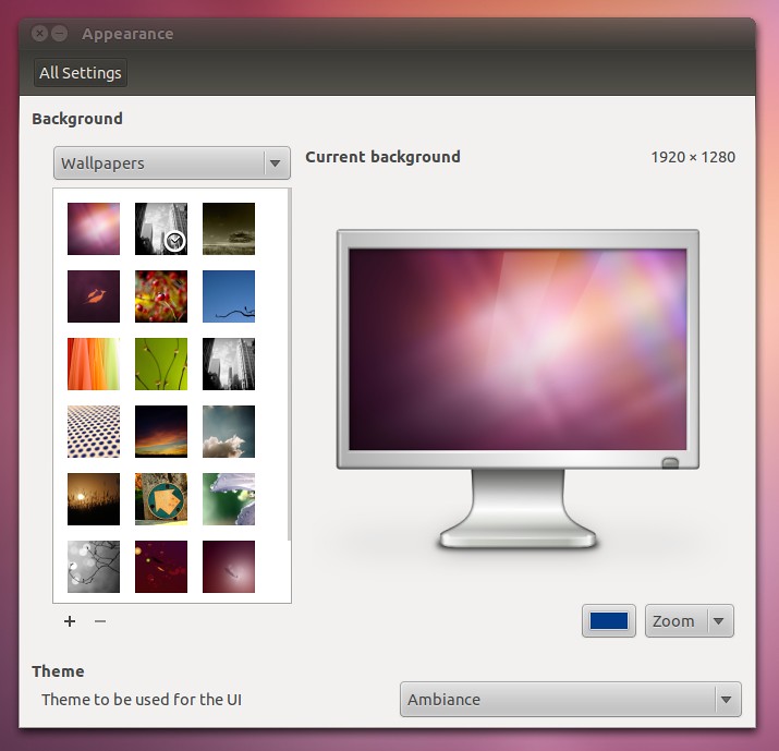
The whole configuration experience feels slicker and easier, and here is one of the panels:
Let’s now talk indicators:
Lots of great work and stability improvements has been performed here such as adding settings links that are relevant to each indicator, improved power and me indicators and other improvements.
Finally, a wonderful new feature added is the refreshed Alt-Tab switcher:
I absolutely love how this works, and I love how it shares the look and feel of the wider desktop. Here you can hit Alt-Tab and then use the arrow keys to move around to select the app you want to see. If there are more apps open than space in the switcher, they concertina just like in the launcher — it looks really cool.
If you have multiple windows open for an app (e.g. Firefox), you can find the icon and press the down arrow to show the multiple windows:
…and that pretty much wraps up the screenshot tour. I hope you enjoyed having a leaf through some of the features you can expect to see in Ubuntu 11.10.
I am really excited for the release, and I particularly enjoy how integrated, unified, consistent and slick the entire system feels. I also love the fact that the design, colouring, and structure is noticeably Ubuntu. So, all in all, I am really looking forward to Ubuntu 11.10 and the opportunity it has to put Free Software in the hands of more and more people. Thanks to everyone in the community who has contributed to it so far!
Beta 1 will be here on the **1st September**, so get ready to test it my friends!

Community Leadership Summit 2011: Rock and Roll

*Thanks to [Reid Beels](https://reidbeels.com/) for the photo*.
A few weeks ago was the [Community Leadership Summit 2011](https://www.communityleadershipsummit.com/) in beautiful Portland, Oregon. For those who are unfamiliar with the event, I started the CLS three years ago to be the central meeting place for those who are passionate about community leadership and management to get together to share ideas, experiences, and get to know each other. Apologies for the delay in getting this online. Life has been more than a little hectic recently. All good though. 🙂
I deliberately architected the CLS with a few core values. Firstly it is *free* and always will be; I believe that it is always important that everyone is welcome and that you don’t need dollars in your pocket to learn how to grow a community. Secondly, the event is strictly vendor-neutral. The goal of the CLS is to provide an environment in which everyone is welcome to share their experience and knowledge and thus everyone is an equal at the event (no-one gets elevated privileges because they work for a particular company). I want offer my thanks to our sponsors [Google](https://www.google.com/), [Microsoft](https://www.microsoft.com/), [Ohloh](https://www.ohloh.net/), [OpenStack](https://www.openstack.org/), [Oracle](https://www.oracle.com/), and of course our wonderful friends at [O’Reilly](https://www.oreilly.com/). Each of these companies sponsored the CLS in the true spirit that the event was intended.
So how did it go?
I was *really happy* with CLS this year. We had a large number of attendees show up on the Saturday and while there are always fewer people on the Sunday, the Sunday was jam packed with interesting discussions and plenty of folks joining us.
The CLS is an unconference, which means that the attendees volunteer and run sessions. This gives the event a far more diverse range of content instead of the other organizers and myself deciding what the topics should be. Throughout the weekend I wandered around and popped into sessions and every session had thriving and vibrant discussions going on.
In addition to the diversity of content, I was really happy this year with the diversity of people attending too. We had people from a wide range of organizations joining us, and many people who had never been to an unconference before. I also noticed a very high proportion of people who work professionally as community managers. I am delighted to see our profession continuing to grow – one of the primary reasons I organize the CLS and wrote the [The Art of Community](https://www.artofcommunityonline.org/) is to continue to grow the profession of community management.
I was delighted to also see event continues to strike a positive gender balance; often these types of events are filled with men, but the CLS has traditionally had a high attendance of women, and more-so this year. I am not sure if this is indicative of community management or the CLS being a comfortable, empowering and safe environment for women, but I hope it is both. On this note, I also put together a [anti-harassment policy](https://www.communityleadershipsummit.com/about/harassment/) (unceremoniously nabbed from the [Ubuntu Developer Summit](https://uds.ubuntu.com/) site) just before CLS11 kicked off.
Selfishly, I am delighted with how CLS11 turned out. I got to listen to everyone’s stories, learn new approaches to community management, and make a bunch of new friends. I really do think I met some of the nicest people in my life at CLS11. 🙂
Fortunately it seems the other attendees came away with a similar experience. The event feedback sessions were full of positive experiences of the event and positive suggestions for the future. There is lots of discussion continuing on Twitter with the [#cls11 hashtag](https://twitter.com/search?q=%23cls11).
For those who are curious, yes, CLS12 is going to happen next year in Portland again. I will get the website updated when I get more details of the dates.
Thanks to the other organizers, Van Riper, Dave Nielsen, Nate DiNiro, Marsee Henon, John Jons, Jeff Osier-Mixon and Erica Bacon for helping with the event and thanks for everyone who came along!

Ubuntu Membership and Developer Surveys
Governance is a hugely important part of Ubuntu, and we have a very open and transparent governance infrastructure. Everyone on our governance boards is committed to keeping Ubuntu an open, fun, and inclusive community with a high quality of contributions. We should all be thankful to our governance community for helping with this important work.
Recently there has been some discussion about how our Ubuntu Membership and Ubuntu Developer processes work and possible areas for focus and improvements. A week ago I committed to putting together a survey to go out to Ubuntu Members and Ubuntu Developers who have applied for either Ubuntu Membership, Core-Dev, MOTU or Per-Package upload rights. I think we need some hard data in these discussions to ensure our ideas are solving problems that affect everyday Ubuntu contributors.
To do this I created two surveys; one to out to the *Ubuntu Membership* applicants and another to go out to *Ubuntu Developer* applicants. The goal of the survey is simple: to ask the people who consume these processes for feedback on their experience, what worked well, and what we can improve. If you have applied in the last few years to be a member or developer you should get an email to fill in the survey. It should only take a few minutes.
When these surveys are complete we can review the results with our governance boards and talk about areas that are working well and how we can improve other areas outlined in the surveys. I think the surveys will give us some useful strong data and help us to continue to grow and improve how we welcome new generations of Ubuntu contributors.

