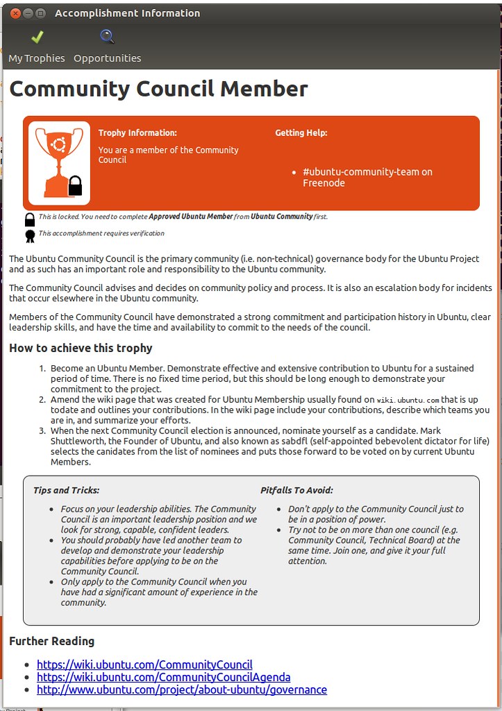
As part of [Ubuntu Accomplishments](https://wiki.ubuntu.com/Accomplishments) you can read information about each accomplishment to find out more about how to participate. This is an important piece of the system: being able to provide useful, discoverable information to our community.
It looks a little like this:

The goal is to create in-depth help and guidance for a variety of ways of participating in the community and elsewhere.
As you can see, with my feeble CSS skills, I have tried to make this use the [Ubuntu brand guidelines](https://design.canonical.com/the-toolkit/ubuntu-brand-guidelines/), but I think there is a lot more opportunity for improvement.
As many others do, I believe that the attention to detail and small refinements help deliver really enjoyable experiences, so I am keen to ensure that the presentation of this content is comfortable, informative, and pleasurable to read.
This information is presented in the application in an embedded webkit widget, and I wanted to reach out and ask the web designers among you if you can help provide a stylesheet (and any recommended HTML changes) to make this look better, more attractive and closer to the look of [ubuntu.com](https://www.ubuntu.com/). I really want the information includes to look truly native on Ubuntu.
Some thoughts on areas of improvement:
* My current design doesn’t really use any of the assets such as the dot patterns, pictograms etc (as an example, I think showing the dot pattern in the background would look better, and it would be cool if some pictograms were used next to the tops/pitfalls sections and possibly as bullet-points).
* I am sure the font sizes and colors could use some adjustment.
* The *Tips and Tricks* and *Pitfalls* table doesn’t have brand adherance whatsoever, so that definitely needs some work.
* The structure of the page could be improved; if you want to propose a better means of laying out the content, feel free to experiment!
If you are a bit of a CSS guru and can make this look better and more like the [Ubuntu brand guidelines](https://design.canonical.com/the-toolkit/ubuntu-brand-guidelines/) you can **[download the zip file](https://ubuntuone.com/5CJAe4kVECr94bwUFYV4Rn)** with an example HTML file and the CSS so you can play with it.
Some things to bear in mind while doing this:
* Don’t assume that all sections are always there. As an example the *Steps*, *Tips/Pitfalls*, *Help*, and *Links* sections are all optional in the accomplishments, so they may not be present.
* Assume that the page is going to be narrow and long (around 700px wide).
* Feel free to include additional pictograms and imagery where appropriate (e.g. such as the dot patterns for the background, pictogram icons for the tips/pitfalls sections etc).
* The rendering widget this is all displayed in is Webkit GTK, so feel free to use webkit-specific CSS extensions.
If you create something and would like to propose it for inclusion, just drop me an email to *jono AT ubuntu DOT com* with a zip file with your improvements.
Also feel free to join the [Ubuntu Accomplishments community mailing list](https://launchpad.net/~ubuntu-accomplishments-contributors) and aks questions!
Thanks!


