Before I get started I want to provide a cast-iron caveat here: *I am not a professional interface designer*. While I have an interest in interaction design and usability, it is not my profession and most of my experience is from working on spare-time projects and developing interfaces for those projects. In other words…the views expressed here are not born from formal training.
OK, with that out of the way I just wanted to talk about menus a little. Recently we released [Ubuntu 11.10 Beta 1](https://cdimage.ubuntu.com/releases/oneiric/beta-1/) and there was the [requisite review on OMG! Ubuntu!](https://www.omgubuntu.co.uk/2011/09/ubuntu-11-10-beta-released-reviewed/) and the conversation in the reader comments rather unsurprisingly descended into a debate about the menus and window controls in Ubuntu 11.10.
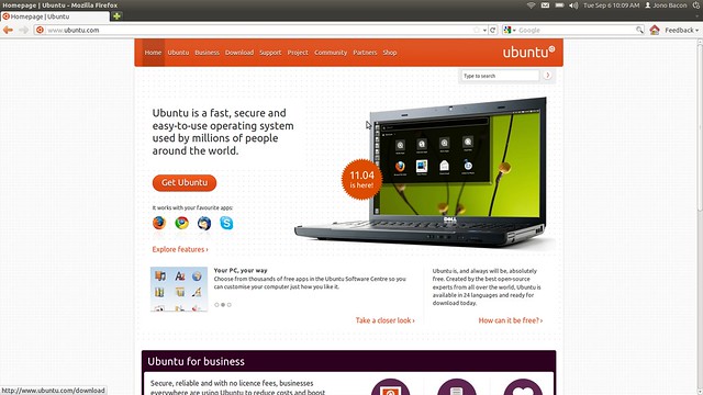
Let me explain the source of the debate. Here is a screenshot of Firefox in Ubuntu 11.10:
As you can see there are no windows buttons up there in the top-left corner of the screen and the menus are not visible either. All you can see is the application title. If you hover over the application title the windows buttons and menus appear so you can use them.
Now, I can understand how this has caused some controversy; the screams of armchair usability pundits rattling off concerns of “*this is a regression in discoverability of the menu and windows buttons*” can be heard in the galleys of that OMG! Ubuntu article. Conceptually I see their point; if the menu is not visible, and it is not in the application window, how do people find it?
This is a misnomer though. Usability and interaction design is all about balancing the effectiveness and discoverability of an interface with the aesthetics of a beautiful, desirable product that we *want* to use. We don’t just want to build functional technology; we want to build desirable, pleasurable technology that fits into our lives.
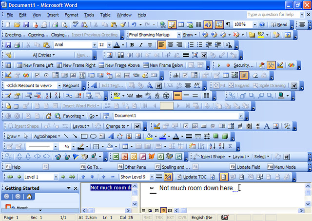
If the argument is that we need to expose functionality for it to become discoverable we can do this but such exposed functionality is often not beautiful and desirable. As an example, this is *Microsoft Word* with all the toolbars switched on

Clearly having everything switched on does not create a beautiful and desirable interface, and I can understand the retort to this would be “*sure, Jono, but menus and window controls are a basic and common function in an interface, so we should prioritize their discoverability and visibility*”. I am not sure I would agree with this. While they are an important and useful function in Unity, the point I take issue with is that they *need to be visible all the time* for people to understand where they are and how they function.
My thesis as to why is pretty simple: *people learn by exploration*. Let’s do a quick exercise. Write down on a piece of paper the last three devices that you purchased. They might televisions, cell phones, kitchen appliances, games consoles, or whatever else. Every one of these devices comes with it’s own interface to operate it. Now, how many of those devices did you sit down and read the instructions for? I am willing to bet it was close to *none*.
You learned those devices by poking around, trying things out, clicking, pressing, pushing, and otherwise playing with and exploring it. Many of these devices will have had entirely new interfaces to you which you had not used before, yet you figured them out. Some elements of the interfaces will have been obvious (e.g. buttons protruded to indicate that they can be pressed) and some elements less-so.
This is why I think the menu and window controls decision makes sense. People like to explore, and it will take next to no time for Ubuntu users to discover that hovering over the text in the panel will display the menu and the window controls. The same can be said for discovering that if you hit the left side of the screen the Launcher appears. The point here is that when you have discovered that the menu is there, you *don’t need it to be visible all the time*.
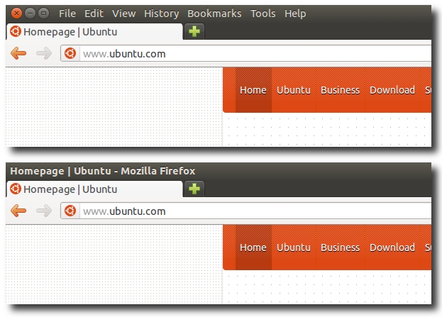
Instead you can hide it and present a far less cluttered interface. Put it this way, let’s look at the two options:

Personally I think the latter looks far sleeker, less cluttered and pleasant to use. Having used Ubuntu 11.10 for a month or so, this small change has really been a nice touch and I am pleased that these small touches continue to refine the Ubuntu experience into a truly desirable and powerful product that is simple and effective for everyone.


